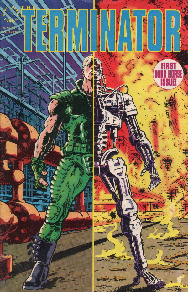
If I could draw like any artist in the history of comics, I think I would have to say Chris Warner. In fact, I did say Chris Warner, when a fellow creator, Jonny Cannon, asked me that very question a month or so ago. Jonny is a fanatical student of classic comic art, picking apart and dissecting the most creative runs across the gold/silver/bronze/modern eras, all to better understand his craft. He hadn’t heard of my choice, and I felt a flush of embarrassment when I explained that Warner’s most famous arc was one of the earliest Terminator comics, licensed and published by Dark Horse in 1990. My decision was strengthened when I got home, dug out my original copies of the 4-issue miniseries, and saw that the covers were still indented, from where 12 year old me had put A4 paper over the top and traced them with a biro. And after a reread I’m absolute in my certainty that these were, are, and probably will always be my favourite comic pages of all time. Here’s a breakdown of the reasons that Chris Warner’s art is so special for me.
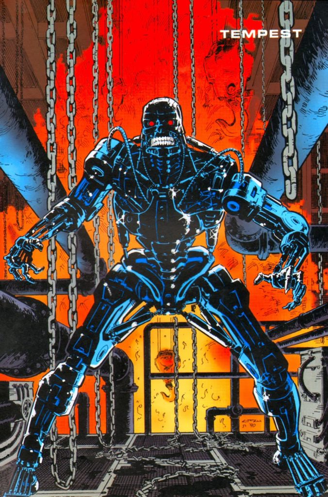
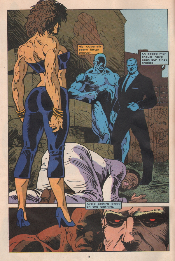
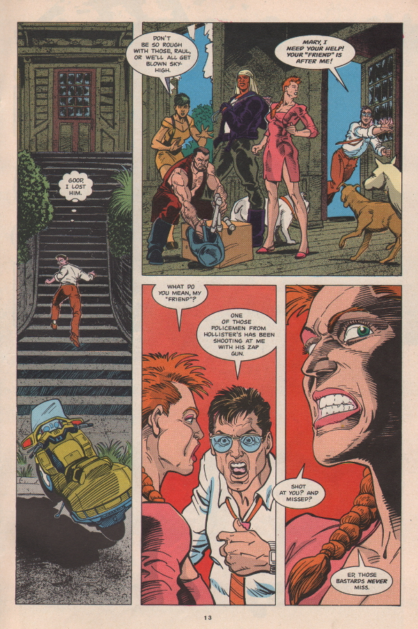
1) Anatomy and Poise: Warner had complete knowledge of the musculature on the arms, torso, back and legs – vital considering the amount of bare flesh in the time travelling scenes of the first issue. Not just that, but he knew exactly how to pose his characters to emphasise just how much power they possessed. His Terminators look utterly solid, immoveable, and ready to snap you in two. Look for example at the muscle definition in the arm of the Terminator in the cover above; a clothesline from that would take your head off. Equally, the female Terminator in the page below, despite being physically smaller than the hapless victim at her feet, is clearly capable of tearing him apart.
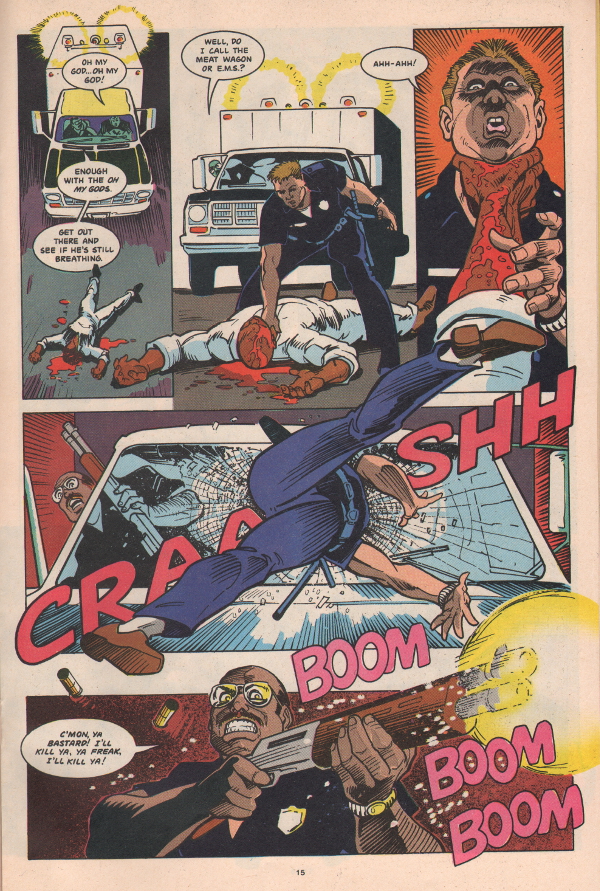
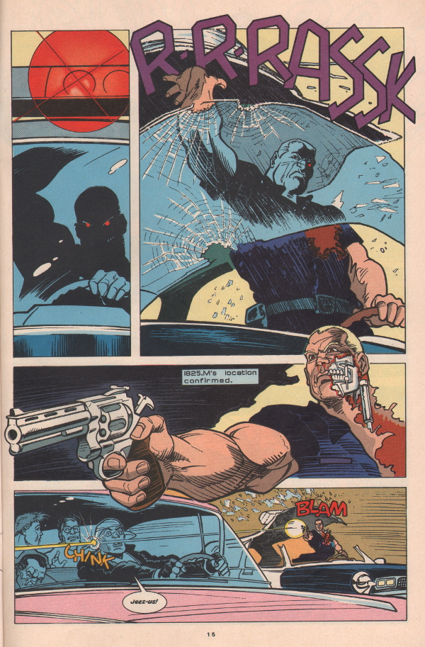
2) Action Packed Storytelling: through extreme camera angles and in particular by breaking the panel boundaries, Warner’s action was off the hook. Carrying art over into the ‘bleed’ (i.e. the white space between the panels) was not a new technique, but this comic was the first time I’d seen it done quite so spectacularly, and I’ve not seen it done better since. The technique can very effectively make objects or characters appear as if they are literally flying out of the page, emphasising the depth of the scene, accentuating the movement of the actors and placing the reader right in the centre of the action. In the 5-panel example below, Warner has interlinked every single panel with overlapping elements, and what’s more, they follow the storytelling flow, urgently leading the reader’s eye around the page to the next panel/beat.
3) Distinct, stylised character designs: the physical and facial characteristics of the humans and Terminators are definitely tipped over to the cartoonish end of the scale. With the big eyes and square jaws, many of these characters would not look out of place in the Transformers or GI Joe Saturday Morning cartoons of this era. It all helps the reader distinguish between the multiple protagonists, and sympathise with them as the team of deadly Terminators quickly close in.
4) Grounded by realism: cinematic lighting cloaks many of the environments and characters in shadows, whilst vehicles and mechanisms are all authentic and convincingly rendered, with high attention to detail. As a result, and despite all the excesses of the design and storytelling mentioned above, the stakes feel high throughout the many explosive set-pieces. The danger posed by the Terminators is clear at all times, which makes the heroes desperate fight for survival all the more thrilling. All of these elements are combined in the blockbuster page below:
The miniseries, written by John Arcudi (co-creator of The Mask) has been collected and retrospectively retitled as Tempest, and I give it a massive recommendation. The storyline was continued in 1991 by writer James Robinson and artist Paul Gulacy in the miniseries Secondary Objectives. It’s actually a decent sequel; a bit more introspective than the first, with a much more noirish, organic art style, and is about as close as we’ll ever get to Michael Mann making a Terminator movie. All the same, it didn’t measure up to the spectacle of Warner’s original for pre-teen me, and I didn’t collect any more of the mini’s after that point.
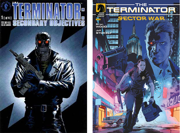
In 2018, the comics franchise was revisited with the 4-issue Sector War miniseries. Jeff Stokely’s art here does a nice job of recreating the sleazy grit of 1984 New York, and his manga style should have been a great fit for a grim sci-fi actioner, but writer Brian Wood’s plot is a bit too linear and quickly just reverts into a fairly generic chase thriller. The future may not be set, but for the next while at least, I think Chris Warner is safely in number one position…